Application & Accesible Website

🎯 The Context of the project
After raising funds from various investors, Ms Martinez has created a company specializing in 100% Made in France connected bracelets. She wanted to offer her connected bracelets for sale on the French market, so she asked us to create the most appropriate strategy for her.

Our role
As a team, we were tasked with designing both a new website and its corresponding mobile application. The goal was to deliver a platform that is fully responsive, intuitive, and compliant with major accessibility standards (WCAG & RGAA). I worked as the Product Designer , alongside a project manager, a graphic designer, and a UX/UI designer.
Main Objective
My mission was to design a user-friendly and ergonomic interface that would support an inclusive experience — ensuring intuitive navigation, high accessibility, and visual consistency across all touchpoints.
Methodology
Our User Experience approach:
– Design Thinking / Agile Méthod
– Organization and implementation : Sprint review with Harmony’s team (Mrs Matrinez, Account Manager, our team)
– Daily review : Project Manager & Product team
Organisation :
– Design Thinking / Agile Méthod
– Organization and implementation : Sprint review with Harmony’s team (Mrs Matrinez, Account Manager, our team)
– Daily review : Project Manager & Product team
Client : Mrs Martinez – The entrepreneur
Sprint : 6 months of project
Team : Me as a Product Designer ⎮ 1 – Product Manager ⎮ 1 – Graphic designer ⎮ 1 – UX/Ui Designer
🖥 SETTING UP THE WEBSITE –
🎯 Information Architecture
Building a Solid UX Foundation
This technique enabled us to better prioritize information and discover the way our users group and name the different contents of web pages. This has helped us to define the sections of our site that correspond to the mental representations of our end-users.
Our aim in doing this is to make it easier to use the interface and locate content on our website.
S – Situation
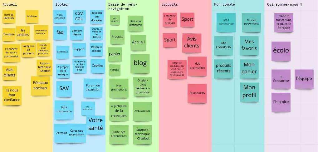
At the early stage of the project, I needed to understand how real users would naturally group information. This step was crucial to avoid designing based only on internal assumptions.
T – Task
As the Product Designer, I decided to run a card sorting exercise to validate the categories and information architecture directly from the user’s mental model. My goal was to ensure the navigation would feel intuitive and familiar to our target users.
A – Actions
Participants were invited to group for an open card sorting workshop, without any guidance from us.
After collecting the data, I analyzed the groupings and identified consistent patterns, outliers, and naming preferences. I then cross-checked these insights with our business priorities and used them to refine our initial content structure.
R – Results
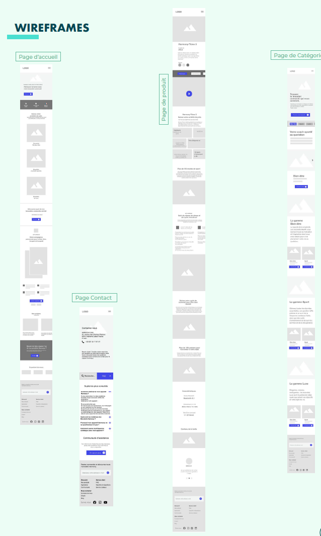
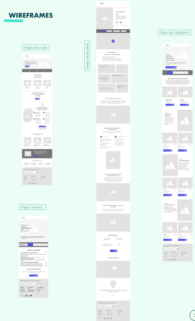
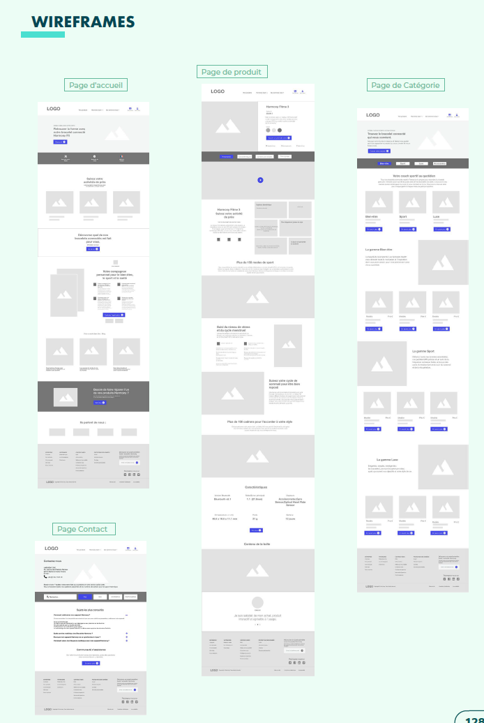
The outcome of this card sorting exercise had a direct impact on our sitemap. Thanks to the users’ input, I was able to reorganize categories in a more logical and user-friendly way. It also helped prevent friction later in the design process, as the foundation matched users’ expectations from the beginning.
Internally, this method helped align stakeholders around a shared understanding of how the information should be structured, backed by user data rather than assumptions.
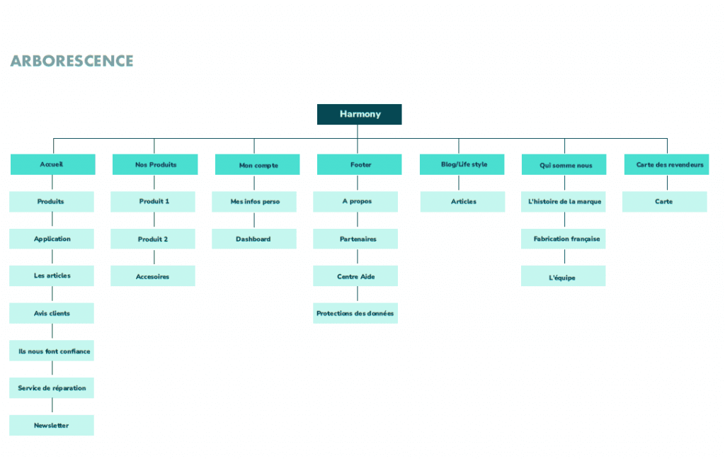
S – We started from scratch, with no predefined navigation or structure.
T – I was responsible for creating a clear, hierarchical sitemap that could guide any type of user.
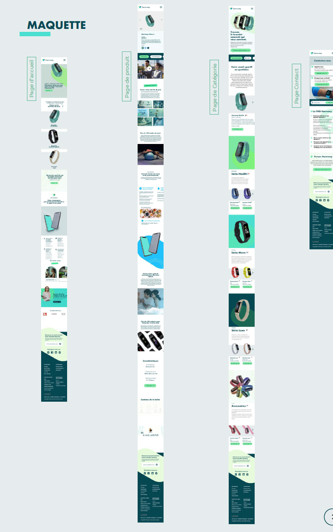
A – I grouped and organized the content into logical categories, then built a structured sitemap using Gloomaps.
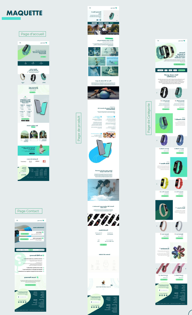
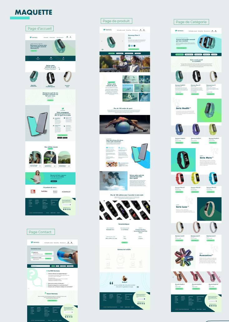
R – The sitemap was quickly validated by the team and became the foundation for all subsequent design phases (zoning, navigation flow, and SEO structure).
✏️ Zoning & Low-Fidelity Wireframes
Structuring the Visual Blueprint
Before diving into the visual design, our team focused on defining the overall structure and layout of each page. I collaborated closely with the UX/UI designer to shape clear, functional layouts that would guide users effectively through the platform.
Through zoning and low-fidelity wireframes, we were able to align the team on content hierarchy, user flows, and navigation logic early on. This groundwork helped us validate the experience quickly and laid a solid foundation for the UI phase.
S – Situation
Once the sitemap was validated, we moved into the layout planning phase. At this point, we hadn’t yet produced any detailed visuals. We needed to decide where the most important elements would go — what the user would see first, how the content would be structured on each screen, and how we could guide their attention.
T – Task
Together with the UX/UI designer, my role as Product Designer was to define a visual structure for each core page before jumping into wireframes. Zoning allowed us to create a shared understanding across the team (including the project manager and graphic designer) before investing time in higher-fidelity work.
A – Actions
I created simple zoning maps to identify the main content blocks: header, hero, call-to-actions, filters, sidebar, product areas, footer, etc.
We reviewed each layout in team workshops to ensure alignment with business goals, user priorities, and technical constraints.
Zoning also helped us flag early challenges like content density, spacing, and screen responsiveness.
R – Results
This step gave us a solid visual skeleton to build on. It helped reduce friction during wireframing, kept everyone aligned, and allowed for faster iteration. It also helped the developers anticipate layout behavior early on, improving feasibility and planning accuracy.
S – Situation
After defining the layout zones, we had a clear structure — but no interaction patterns or flows yet. We needed to test how users would move through the product, where they would click, and how they would complete key actions — all without the distraction of colors or visual design.
T – Task
My responsibility was to turn our zoning sketches into functional, testable wireframes that would support our main user journeys. We wanted to validate the UX early, before involving UI or development resources.
A – Actions
Using Figma, I created a full set of low-fidelity wireframes across 6 core pages: Home, Product page, Category page, Legal, Support, and Contact.
The UX/UI designer supported with interaction flows and edge cases, while the project manager ensured we covered all business needs.
We reviewed these wireframes internally and iterated quickly based on team feedback and user test sessions. This lean approach helped us stay agile and reduce unnecessary rework.
R – Results
The wireframes helped us identify pain points in the journey and fix them early. They also made it easier to onboard stakeholders, who could now visualize the experience without needing to interpret abstract documentation.
By the time we reached UI design, the structure was solid, and we could focus fully on look & feel, accessibility, and interaction detail.
🎨 UI Design & Mockups
Bringing the Interface to Life
Once we had validated the structure, I moved to the visual design phase.
I was in charge of designing a clean, modern, and inclusive UI aligned with accessibility principles and brand identity. I created high-fidelity mockups and built a design system in Figma, including reusable components, typography, spacing rules, and color variables.
The mockups were ready for handoff, and the design system helped the dev team implement consistently across platforms.
Wireframing
S – Before jumping into wireframes, we needed to define the layout logic of each key page.
T – I mapped out the different zones to allocate core elements like the header, CTAs, product sections, and footer.
A – I created clear, block-level layouts to align the team on content placement.
R – The zonings were validated and helped us avoid misalignment during wireframing and UI design.
UI KIT
S – With multiple contributors and design iterations, we needed a scalable system.
T – I took the lead on creating a structured, reusable UI library.
A – I built a Figma design system including tokens (colors, fonts, spacing), components (buttons, forms), and rules for responsive and accessible UI.
R – The system saved us time, improved consistency, and simplified the developer handoff thanks to proper documentation.


Mockup
S – After validating our low-fidelity wireframes and user flows, it was time to move into the visual design phase. We needed to transform functional layouts into an engaging, accessible, and responsive interface that reflected both the brand identity and the users’ expectations.
T – As the Product Designer, I was responsible for designing the high-fidelity mockups, ensuring visual consistency, accessibility (WCAG), and responsiveness across both web and mobile versions. The mockups had to serve both as design references and developer-ready specifications.
A – I built the UI in Figma, starting from our validated wireframes and zoning. To streamline the process, I created a design system including color tokens, typography rules, spacing grids, and reusable components (buttons, inputs, navigation, etc.).
I worked closely with the graphic designer to ensure brand alignment, and with the developers to keep the design technically feasible. I also used Spec Mode in Figma to prepare accurate handoff for development, minimizing the need for clarification.
R – The final mockups reflected a clean, modern, and inclusive interface. The visual system was consistent, responsive, and fully aligned with accessibility standards.
Having a structured design system made future iterations easier and significantly reduced development time. The UI was well received by both stakeholders and developers, and served as a reliable visual guide throughout the implementation phase.
Context and Objectives 
With Haribo Custom, the goal was to create a fun, interactive experience that allows users to customize Haribo bears in an intuitive and engaging way. As a UX/UI Designer, I wanted to merge Haribo’s colorful, playful universe with user-centered design principles to stimulate creativity while ensuring smooth navigation.
User Research & Analysis 
The process began with user research to understand expectations:
- Target audience: children, teenagers, and young adults interested in customization and interactive games.
- Identified needs: ease of use, intuitive interface, quick interactions, and immediate visual feedback.
- Motivations: the desire to create, play, and share their designs.
UX Approach – User-Centered Design 
Cognitive Simplicity
I applied the principle of minimal cognitive load to keep users focused on customizing their bears without getting lost in complex menus. Each step in the customization process is linear and guided, ensuring a smooth user flow.Immediate Feedback
To boost engagement, every user action (changing colors, adding textures) triggers immediate visual feedback. This creates a direct connection between the action and the result, which is essential in a playful, interactive environment.Clear Visual Hierarchy
The interface is built around a clear visual hierarchy: customization options are easily identifiable through simple icons and contrasting colors, while the bear remains at the center of the screen to stay in focus.Flow and Gamification
I integrated subtle gamification elements:- Step-by-step progression: each phase (choosing shapes, colors, textures) is structured like mini-goals.
- Sense of achievement: smooth animations enhance transitions, reinforcing the user’s satisfaction with each modification.
UI Design – Crafting an Engaging Visual Identity
- Color Palette Inspired by Haribo
I chose vibrant, candy-inspired colors to reflect Haribo’s playful universe. Red, yellow, and pastel shades evoke energy, joy, and creativity. - Playful Typography
The use of a rounded, friendly font enhances the fun, accessible feel of the game. It’s easy to read across all devices, supporting a responsive experience. - Micro-Interactions and Animations
Subtle animations (button highlights, bounce effects) make the interface feel more dynamic and interactive without overwhelming the user. These micro-interactions spark curiosity and encourage deeper exploration.
- Color Palette Inspired by Haribo
Prototyping & User Testing 
After the wireframing phase, I created an interactive prototype in Adobe XD to simulate the final experience. I conducted user testing to identify areas for improvement:
- Optimizing user flows: simplifying steps that felt too long or complex.
- Refining visual feedback: adding smoother transitions when changing colors and textures.
Final Result
Haribo Custom offers an experience where customization feels effortless and fun, thanks to an interface designed to be both intuitive and visually engaging. The UX/UI design is built on a foundation of simplicity, visual appeal, and interactivity, creating an environment where users feel free to express their creativity without friction.
Lorem ipsum dolor sit amet, consectetur adipiscing elit. Ut elit tellus, luctus nec ullamcorper mattis, pulvinar dapibus leo.